
EdFed
America's Top Student Loan Consolidator
175 South Lake Ave., Suite 200
Pasadena, CA 91101
ATTN: Marketing Director
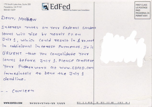
Dear EdFed:
I'm very impressed that you appear to have hired a staff of small foreign children and/or illiterate convicts to painstakingly hand-write your latest direct mailings. While many direct-mailers employ fonts that merely look like handwriting, the indentations in your postcard, the corrected misspelled words, and overall piss-poor penmanship unmistakably establish that your entreaty to consolidate my student loans was indeed prepared by a human being. I commend you.
Unfortunately, I will not be consolidating my student loans with you, as I have no need for such services. Nonetheless, I would like to offer the following feedback on the work of "Carleen." First off, you should teach her to make her a's look less like u's. Secondly, there's a difference between an upper-case "F" and a lower-case "f" that Carleen does not appear to grasp (see, e.g., the word "beFore" [sic] in line six of the main text). Finally, it is proper form to place the comma in the salutation after the addressee's name, rather than after the "Dear." With these tips, I hope that Carleen might find more success in luring people into your lending pool.
In addition, I hope that when Carleen and the rest of your scribes develop crippling arthritis from hand-writing junk mail for hours at a stretch, EdFed will find the decency to dip into its (doubtless) exhorbitant interest collections and provide some healthcare.
Very truly yours,
Robert H. Bork

I got one of those too!!! (I can't remember if it was Carleen, though)